
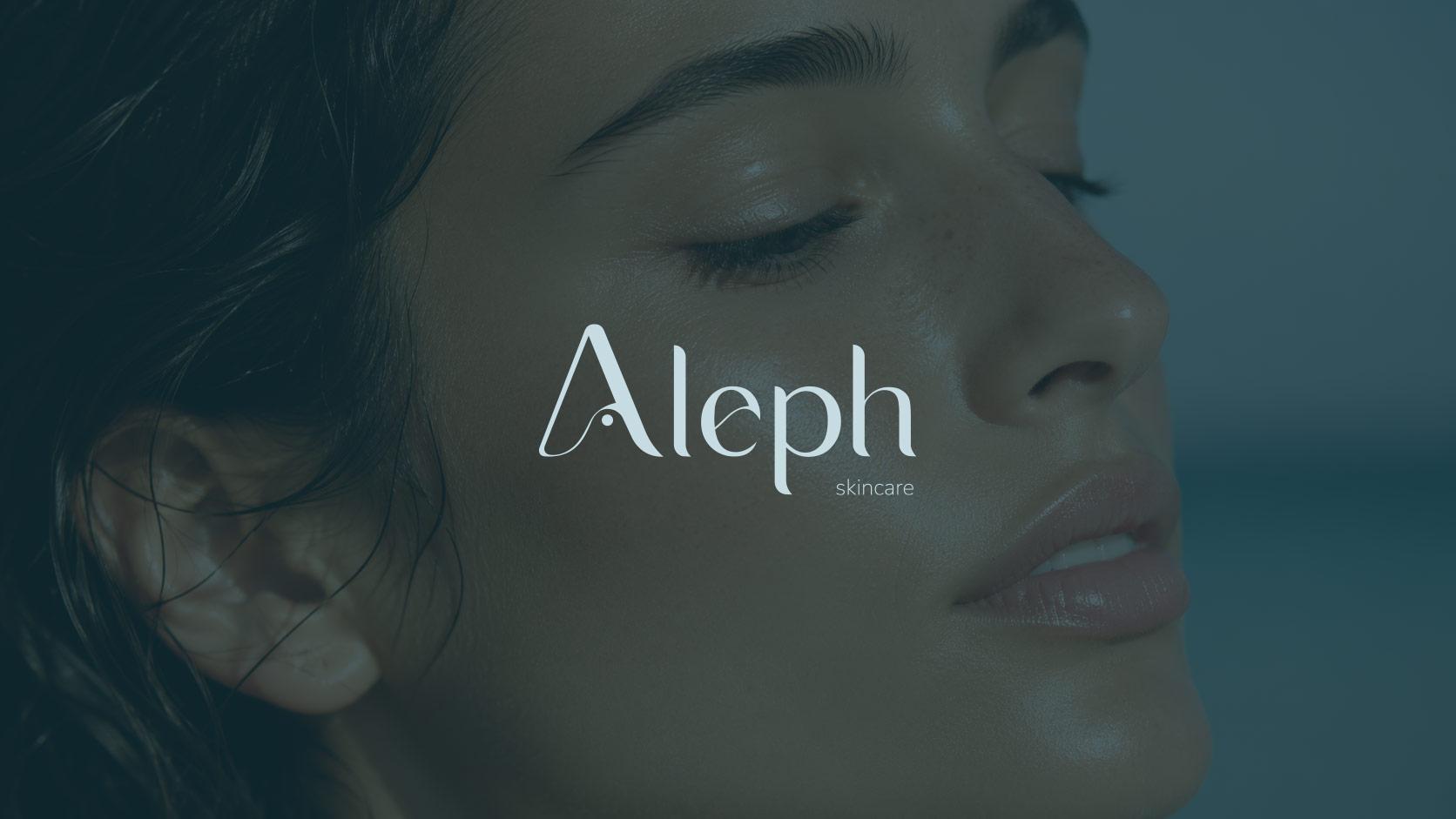
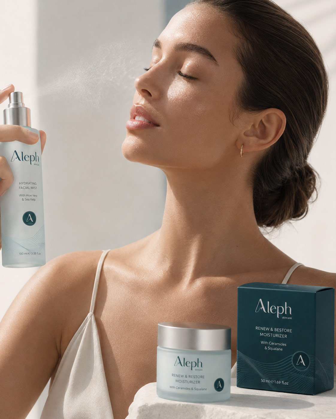
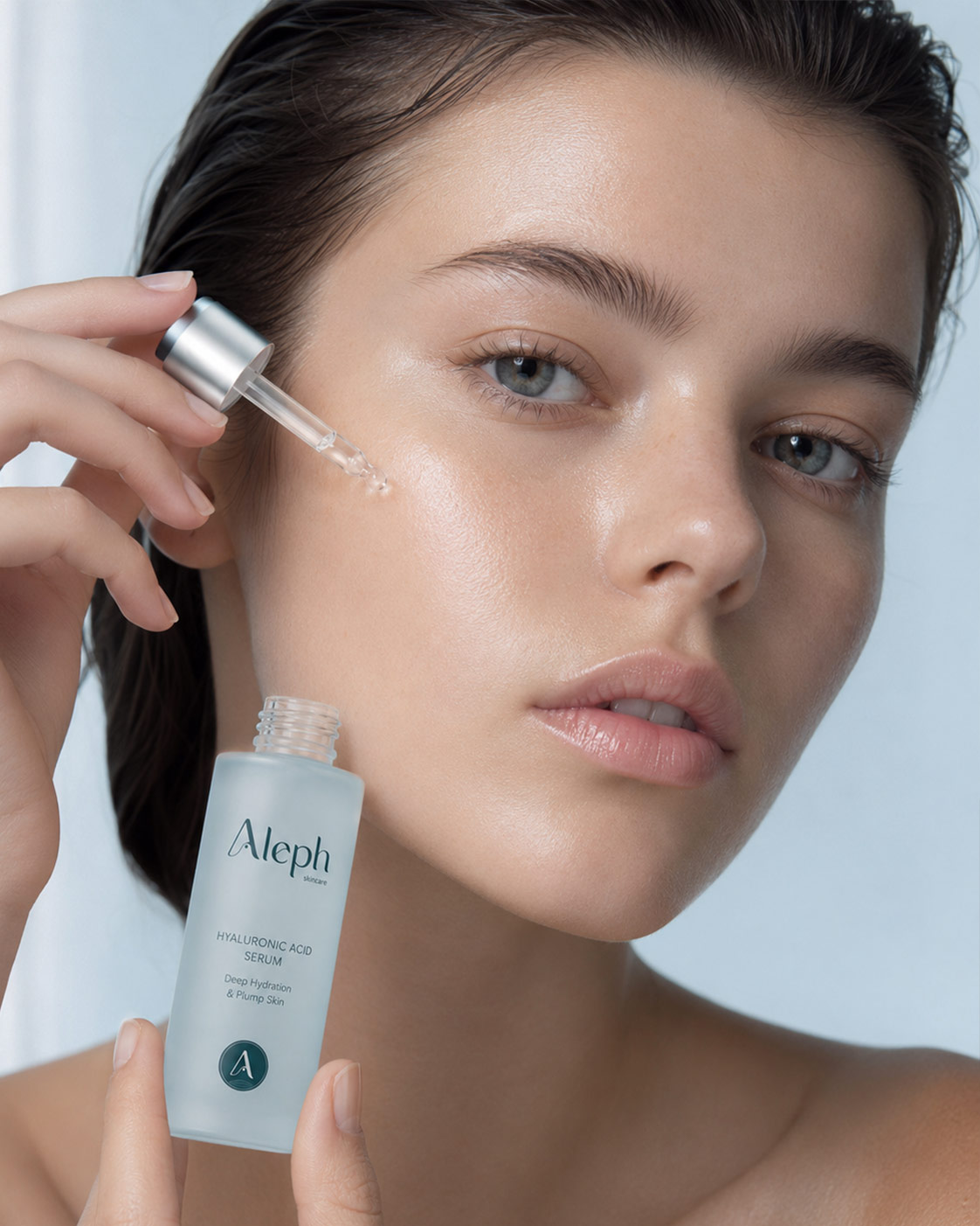
A refined visual identity for an Australian skincare brand, created to balance natural credibility with a fresh, contemporary beauty aesthetic.
01 ✸ The challenge
Aleph needed a visual identity that could appeal to a conscious, style-aware 18–35 audience while still communicating trust, product quality and skincare credibility.
The challenge was to avoid the overly clinical language often used in skincare, without moving too far into lifestyle branding. The identity needed to feel clean, modern and considered while giving the brand enough personality to compete in a visually crowded beauty market.
CLIENT
Industry
Role
Scope
02 ✸ THE APPROACH
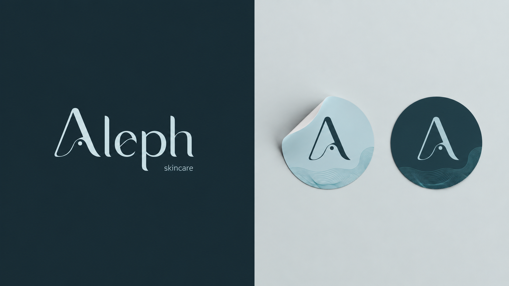
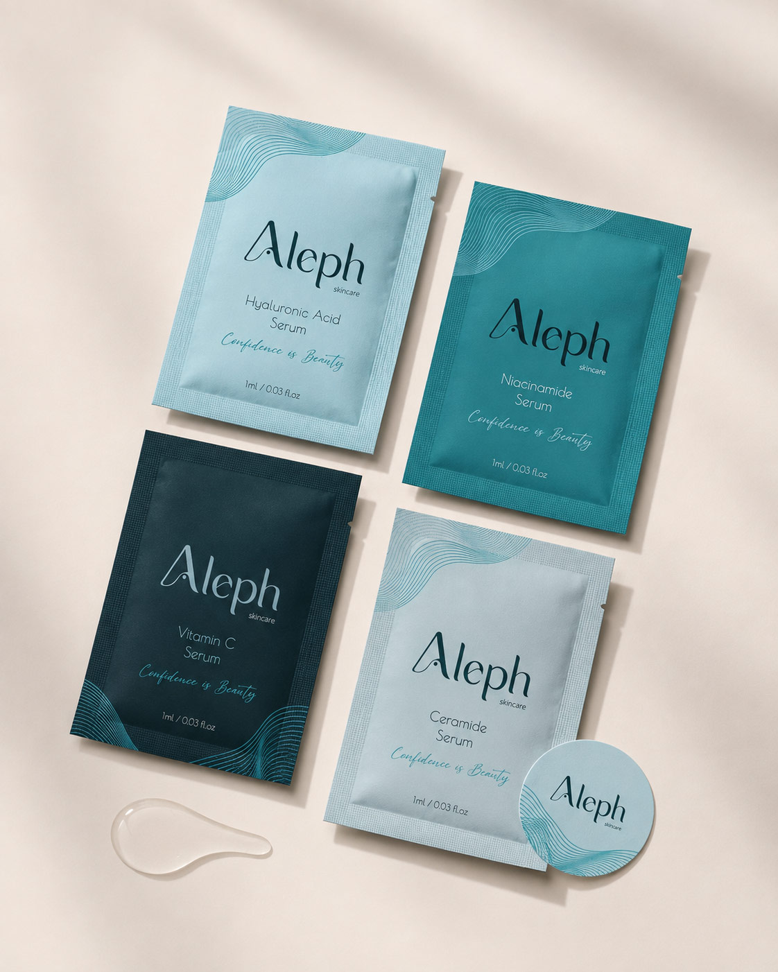
I developed a minimalist identity centred around an elegant wordmark and a simplified “A” brand mark, creating a system that could move easily between packaging, digital content and smaller applications.
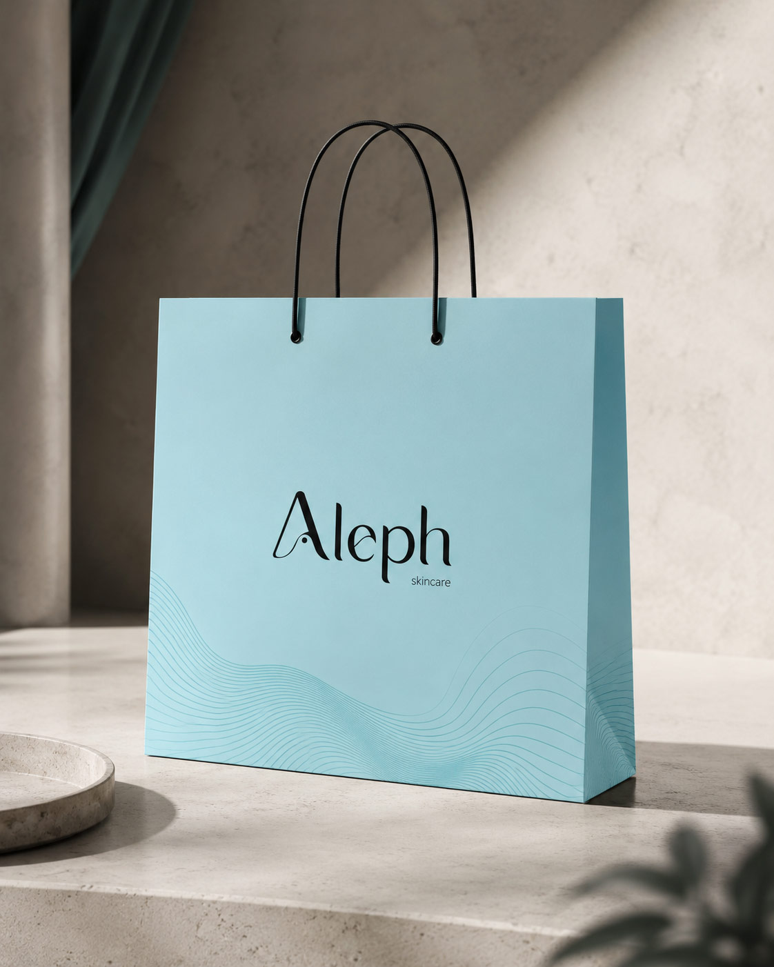
The colour palette draws from ocean tones, combining pale blue with deeper teal shades to communicate freshness, purity and calm without relying on the predictable green palettes often associated with natural skincare.
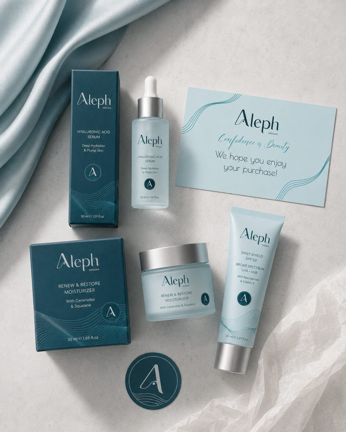
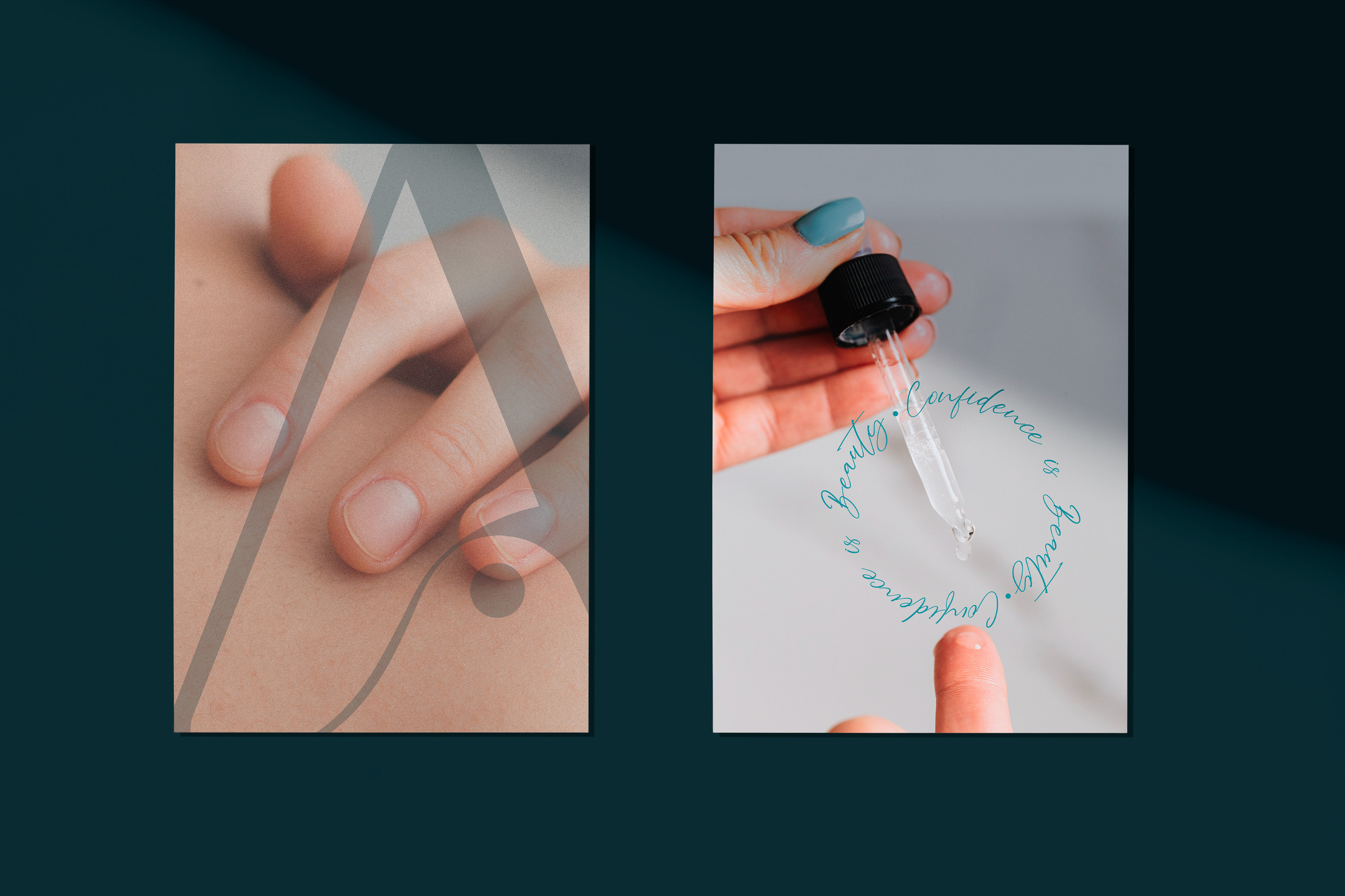
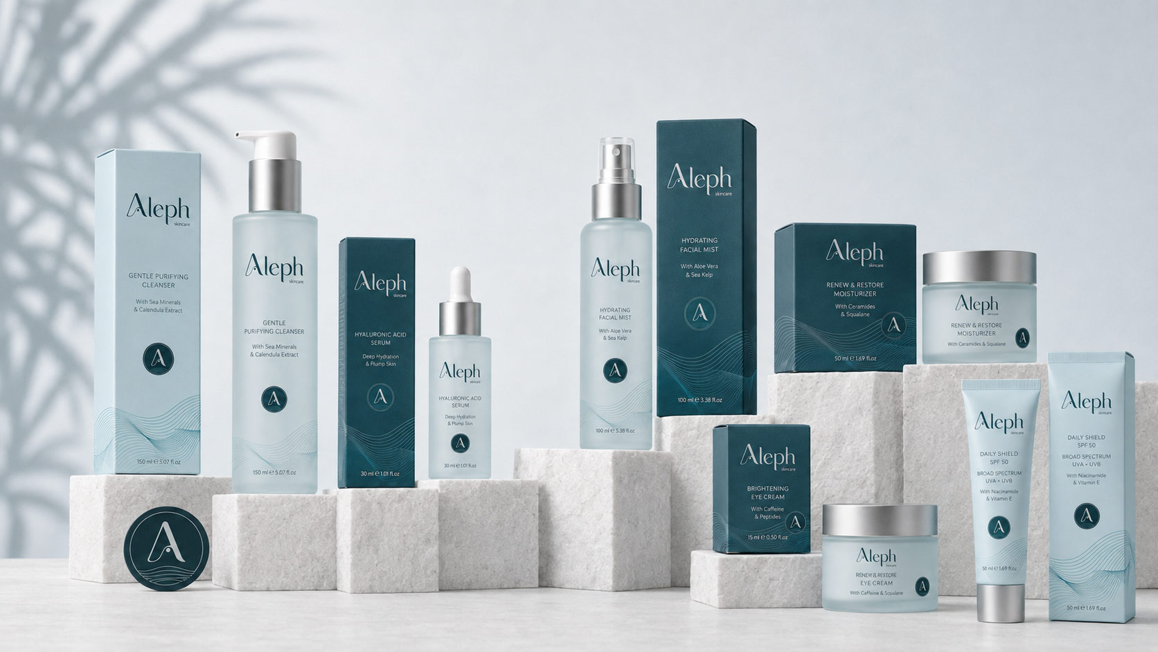
Refined typography and flowing graphic elements introduce softness and movement, balancing the more structured logo system. I then carried the identity into packaging, printed materials and digital applications to create a consistent visual world around the products.
03 ✸ The Outcome
The final identity gives Aleph a cohesive and recognisable presence that feels clean and elevated while remaining approachable.
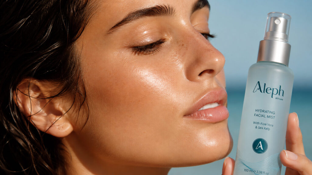
Across packaging, printed touchpoints and digital applications, the brand combines natural cues with a more polished beauty aesthetic, helping it communicate purity and confidence without feeling overly clinical or predictable.
A refined skincare brand identity design to stand apart from both clinical skincare brands and overly organic visual conventions.
A primary wordmark and simplified brand mark designed to remain recognisable across packaging and smaller digital applications.
Colour, typography, graphics and packaging elements developed as one consistent visual system around the skincare range.
Start a project
Send a short outline of what you’re working on and what you need help with. I’ll review the scope and fit before recommending the next step.
View project