

A bold, energetic visual identity for a healthy grilled chicken takeaway, balancing fitness-led positioning with the warmth and flavour of fire-grilled food.
01 ✸ The challenge
Fit Chicky needed a visual identity that could communicate two things at once: healthy eating and grilled flavour.
The challenge was to create a brand that felt fresh, energetic and fitness-conscious without falling into the usual visual language of diet food. At the same time, the identity needed enough warmth and personality to make the food feel satisfying, flavour-led and appealing in a fast-paced takeaway environment.
CLIENT
Industry
Role
Scope
02 ✸ THE APPROACH
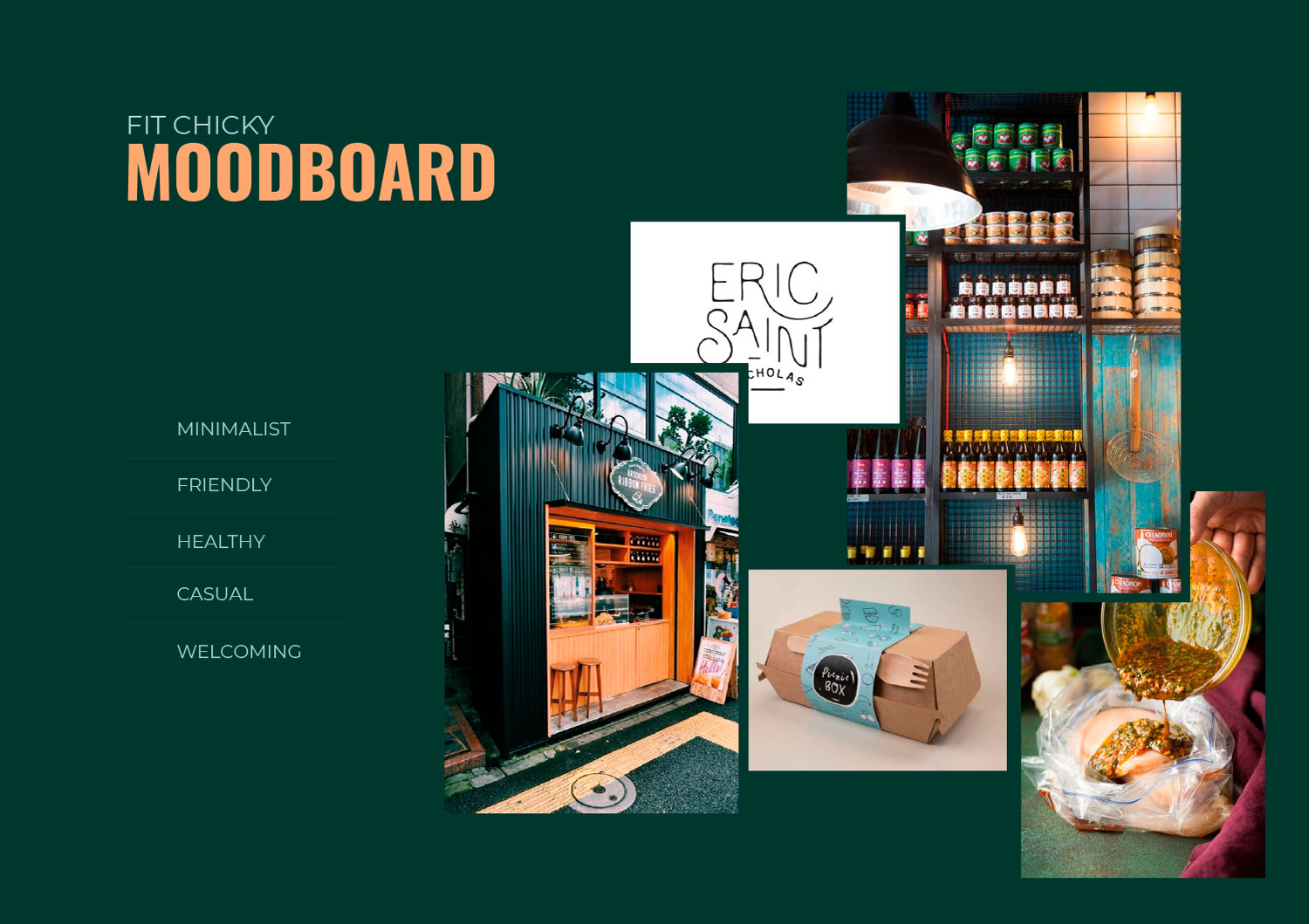
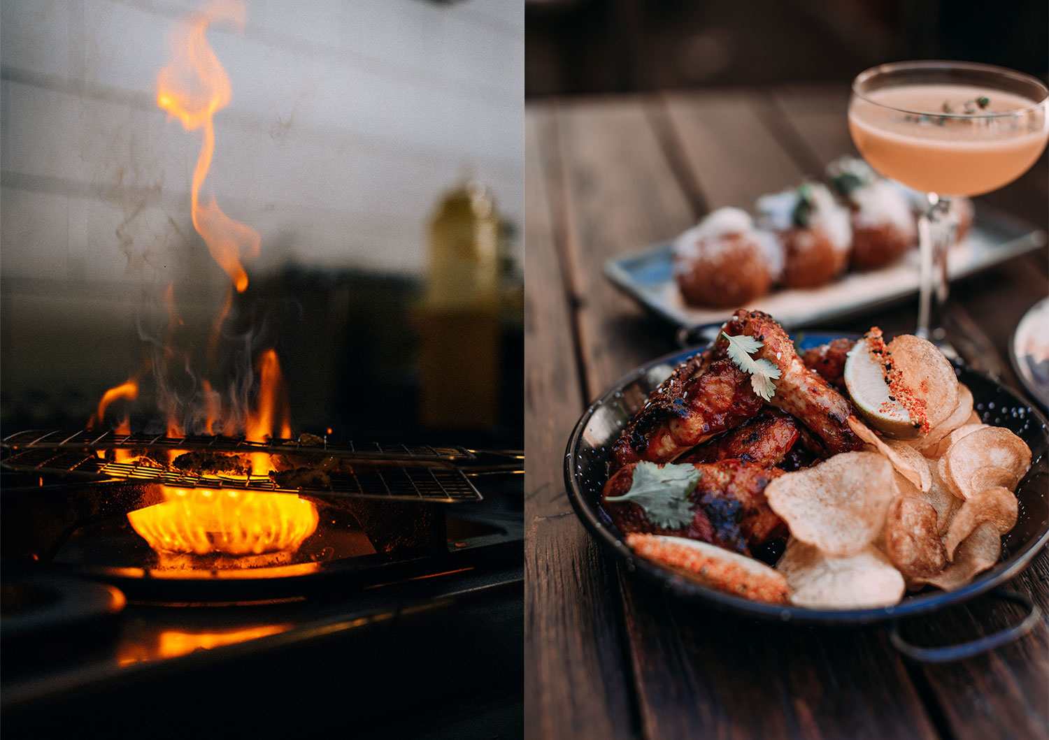
The visual direction was built around the contrast between healthy eating and flame-grilled cooking.
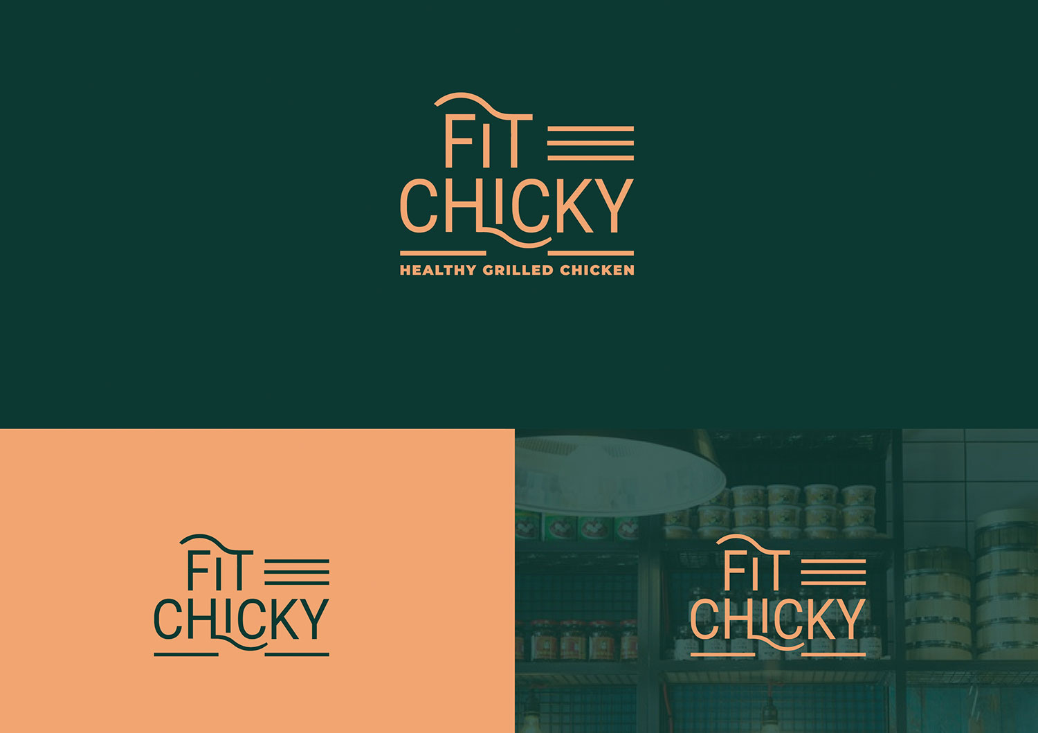
A deep green became the foundation of the identity, reinforcing freshness and a more health-conscious positioning, while orange was introduced as a direct reference to heat, fire and grilled food.
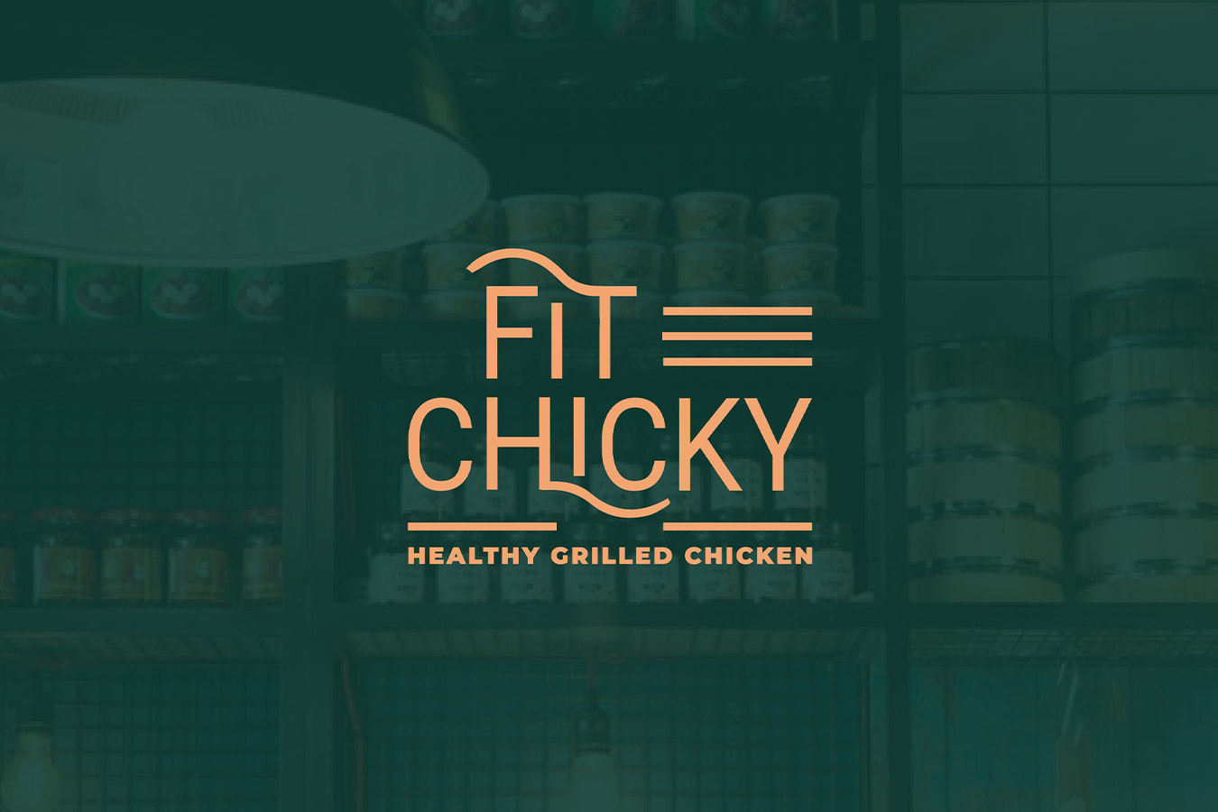
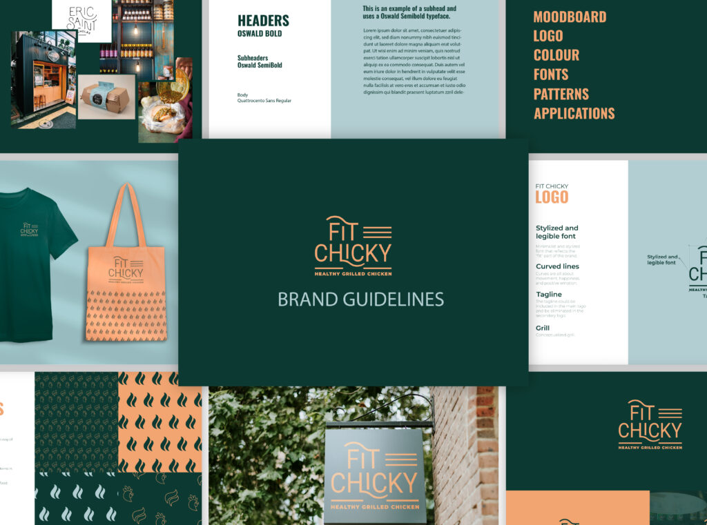
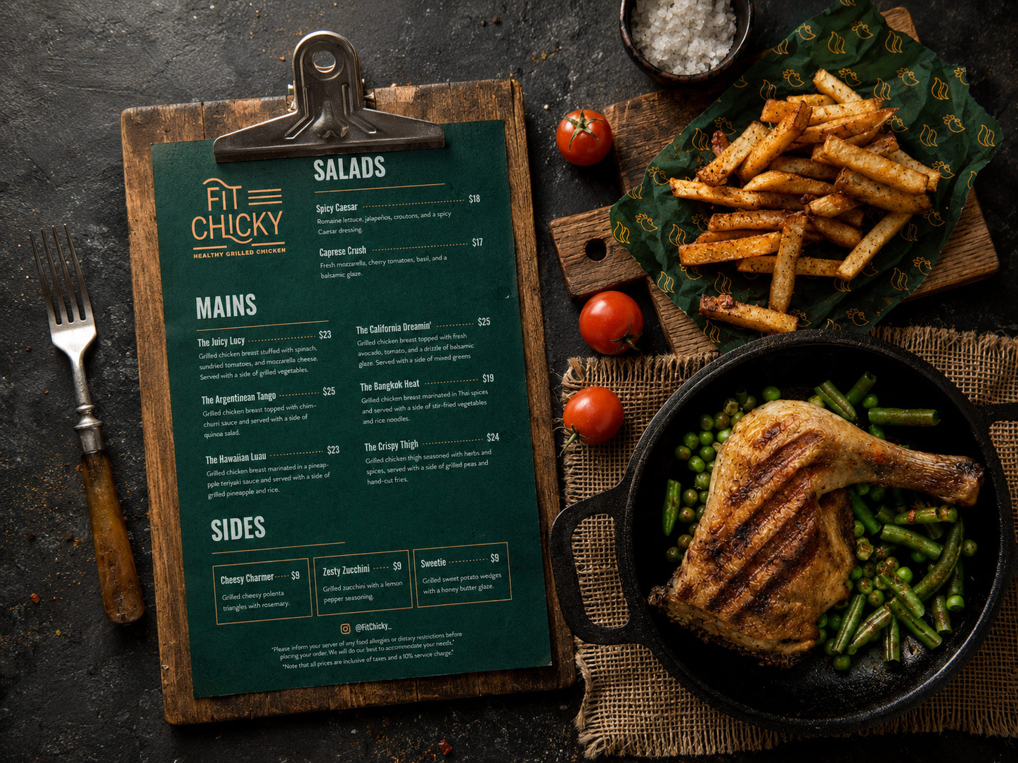
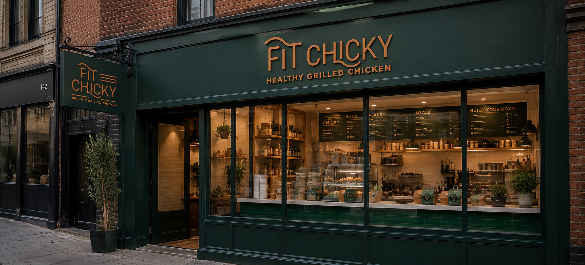
The logo combines a bold typographic treatment with simple graphic elements that suggest movement, energy and grilling. I then extended the identity into a wider brand system designed to work across takeaway packaging, menus, uniforms, signage and in-store touchpoints.
The result is a system that feels recognisable and energetic without becoming overly sporty or overly rustic.
03 ✸ The Outcome
The final restaurant brand identity design gives Fit Chicky a clear visual position between healthy food and casual grilled dining.
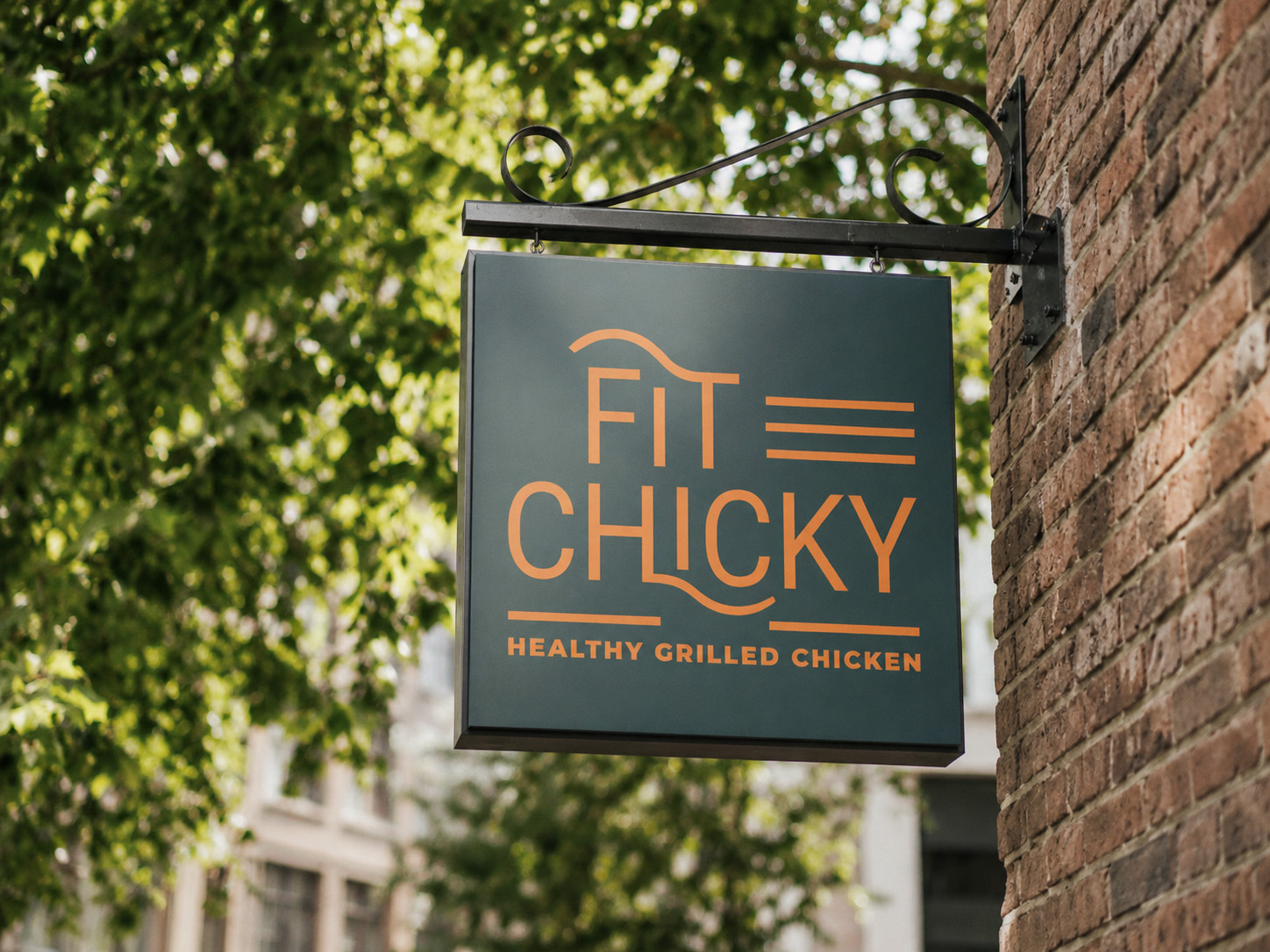
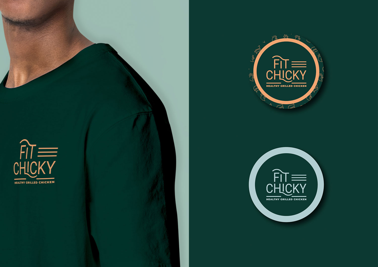
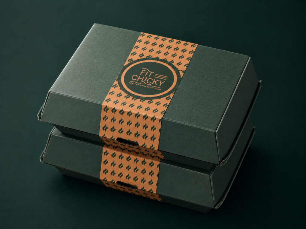
The system is flexible enough to work across customer-facing touchpoints while keeping the brand immediately recognisable, whether it appears on packaging, menus, staff clothing or exterior signage.
A visual identity that communicates healthy eating without losing the appetite appeal of flame-grilled food.
Logo variations, patterns and graphic elements designed to work consistently across packaging, print and physical spaces.
A bold green and orange palette that helps the brand stand out across packaging, uniforms, menus and storefront applications.
Start a project
Send a short outline of what you’re working on and what you need help with. I’ll review the scope and fit before recommending the next step.
View project