
↔
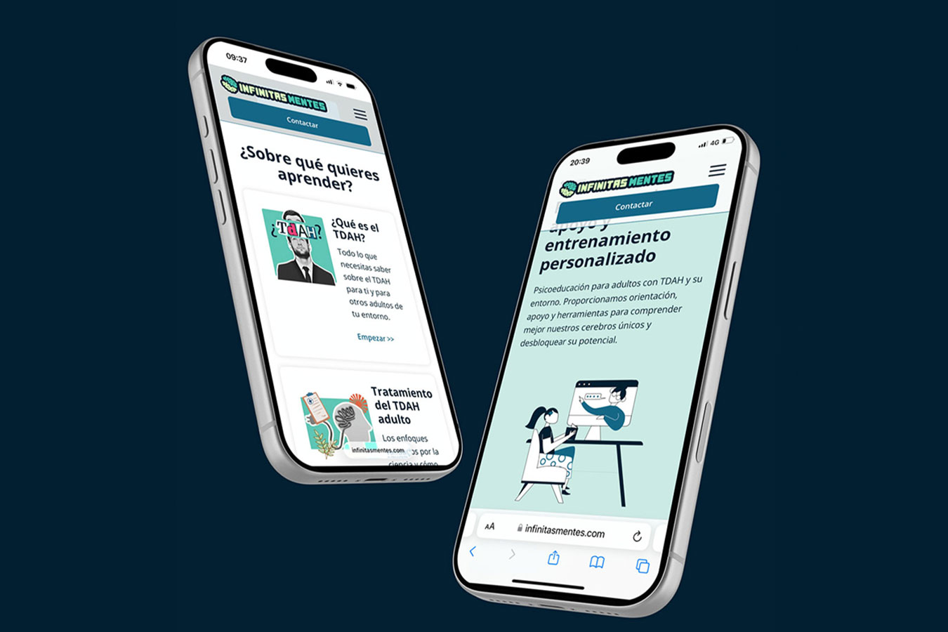
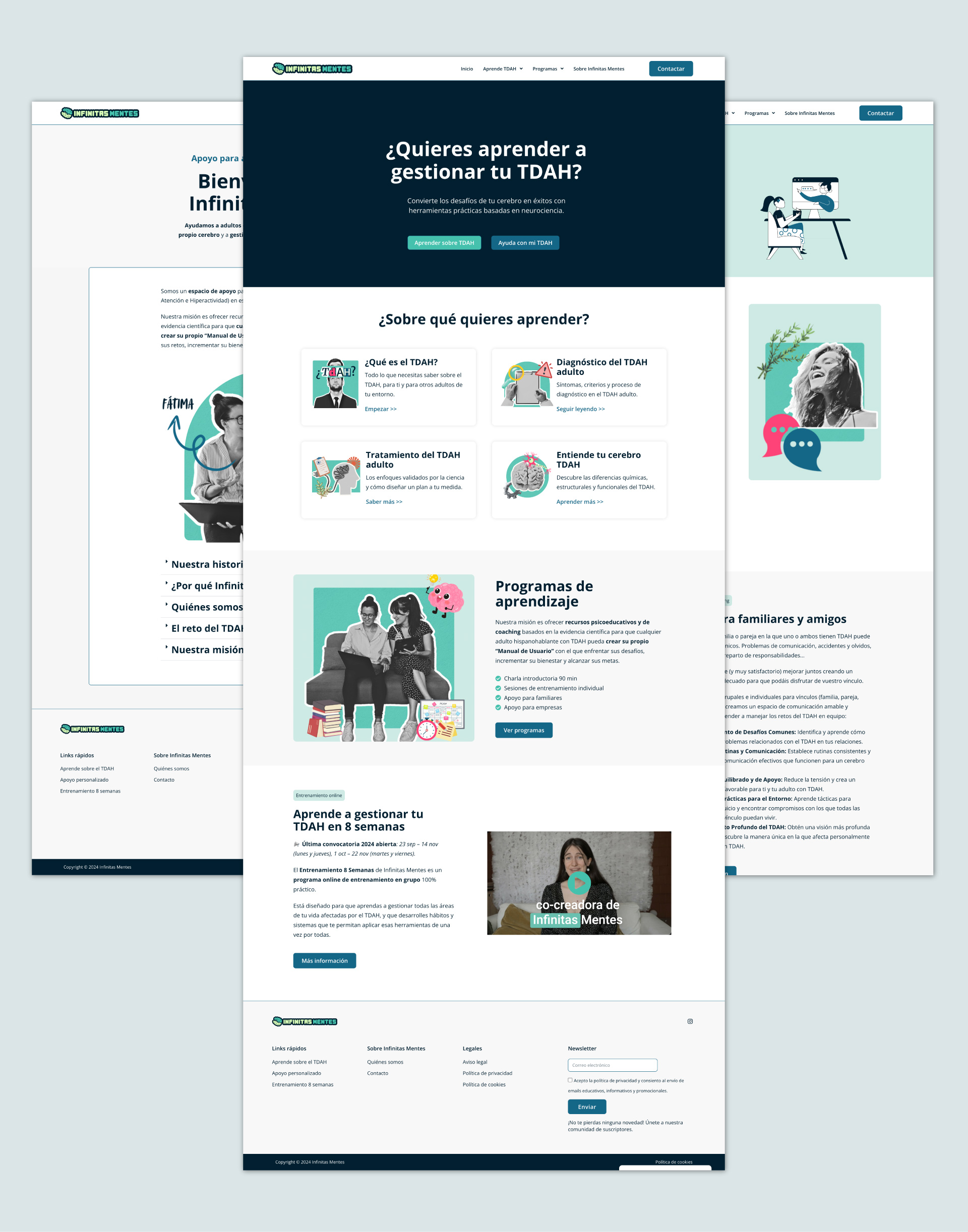
Inclusive brand identity and WordPress development for a Spanish ADHD education platform built to make complex information feel clear, accessible and approachable.
01 ✸ The challenge
Infinitas Mentes approached me before launching its online presence, with the ambition of creating an accessible platform for adults with ADHD.
The challenge was to build a visual identity that felt credible enough for educational content without becoming clinical or institutional. It needed to be approachable, distinctive and flexible enough to work across educational resources, social media and digital platforms while considering the different ways its audience experiences visual information.
CLIENT
Industry
Role
Scope
02 ✸ THE APPROACH
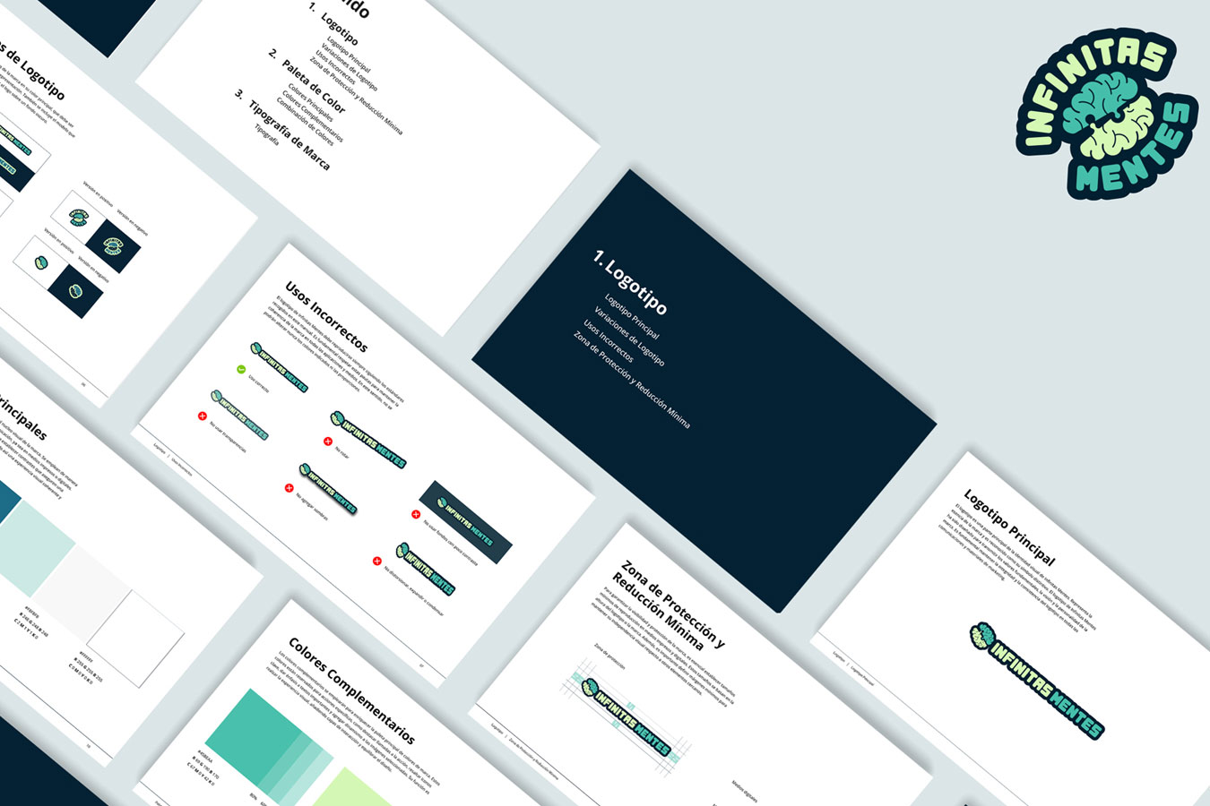
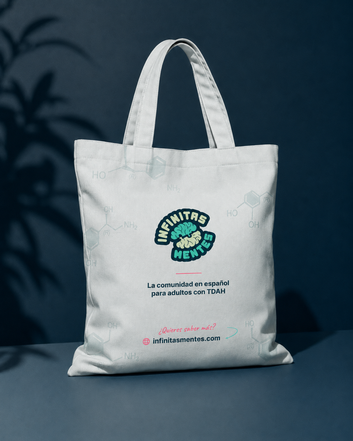
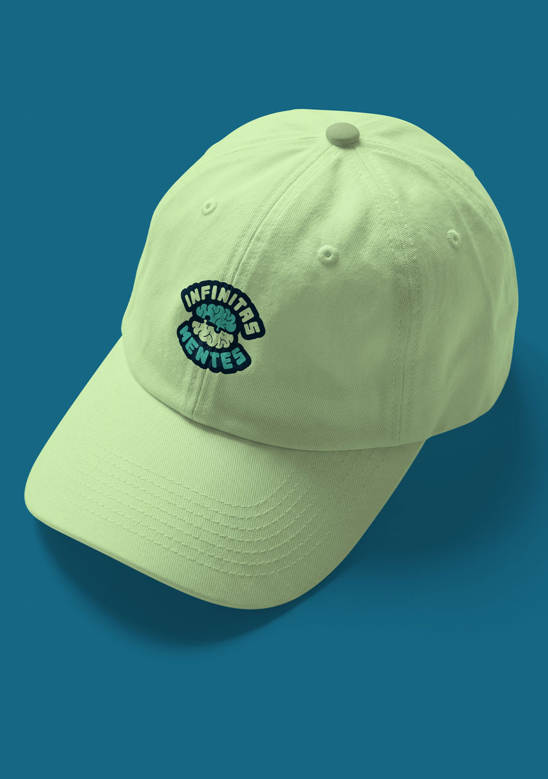
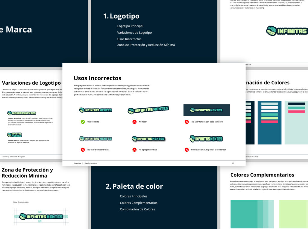
The identity was built around clarity, inclusivity and personality. I developed a flexible logo system centred around the brain symbol, supported by multiple configurations designed to work consistently across websites, social platforms and smaller digital formats.
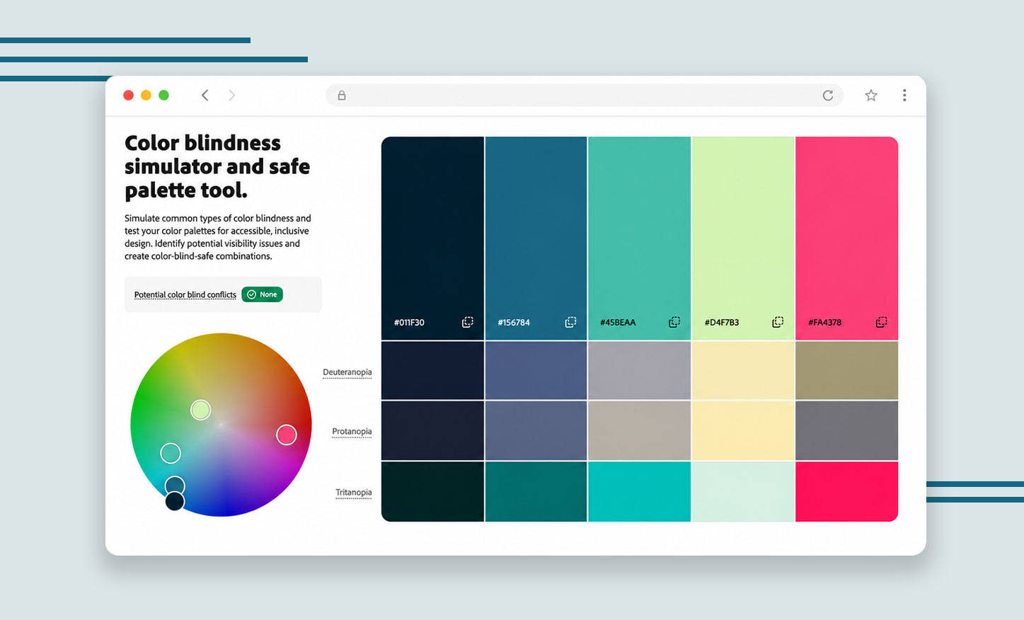
Colour accessibility was considered from the beginning. The palette was tested with colour vision deficiencies in mind, using controlled contrast and combinations that keep information easy to distinguish while giving the brand an energetic and recognisable personality.
Typography followed the same principle. Open Sans was selected as the primary typeface for its clean structure and readability across both digital and printed applications.
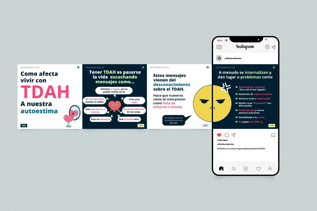
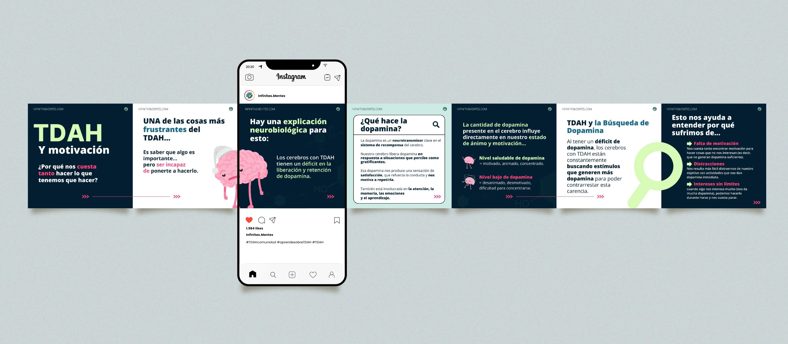
I also developed a wider visual system for social content, showing how the identity could adapt to educational posts and everyday communication as the community grew.
03 ✸ The Outcome
The result was a flexible brand system that gave Infinitas Mentes a clear visual foundation from launch, balancing accessibility with a distinctive and approachable personality.
Since then, the platform has expanded into educational content, online programmes and ADHD resources, while retaining the core visual identity across its digital presence
A colour and typography system designed around readability, contrast and inclusive communication.
Multiple logo variations and brand applications created to work consistently across digital and social formats.
The brand has since grown into a large online ADHD community.
Start a project
Send a short outline of what you’re working on and what you need help with. I’ll review the scope and fit before recommending the next step.
View project